WHY NOTж

Design. Systems. Experiences.

We decide
what deserves
to exist.
And amplify it.
Stories / 01—09

Things we
thought should
exist:

Story 01 / 09
Things We Build

Ideas into
systems.

01

Brands

Ideas made recognizable through identity, language, and experience.

02

Packaging

Physical moments where products meet people.

03

Websites

Digital environments built around behaviour and interaction.

04

Spaces

Physical environments designed to shape experience.

05

Products

Objects and tools designed with purpose.

06

Systems

Structures that transform complexity into clarity.

Principles

What guides
the work.

01

Beauty

Beauty is not decoration. It is alignment between idea, function, and form.

02

Structure

Ideas become valuable when they are supported by systems that allow them to last.

03

Discernment

Not everything deserves attention. Design begins with deciding what matters.

04

Responsibility

Every designed experience shapes what people notice, remember, and value.

05

Question

Every worthwhile creation begins by asking: why not?

WHY NOTж

Selected Partners

People we
build with.

01
S3TK.

“We invested a few thousand dollars in the complete package. The extra revenue we generate each month now more than covers that investment.”

02
SADUKU

“I told them I wanted my brand to feel like a carpet, and somehow they just got it. Every packaging detail feels intentional, and our customers notice.”

03
1015 CAFÉ

“They’re bringing my café dream to life beautifully. The strategy package helped us build something that’s made to last, not just another café that looks good for a year.”

04
RU5AM

“I came in expecting a website. I left with an entire brand. They even redesigned our store to match, and everything finally has personality.”

05
ASSOLD.

“They built a game into our pre-launch website that helped us gain over 20,000 extra newsletter subscribers. It actually worked, wow.”

06
EVUTUR

“We’re probably their most difficult client; we ask for a new website every few years. Somehow, they always manage to make it even better.”

Selected Work

01

Thousands of watches. One system.

02

One cloth. Infinite movement.

03

Waiting became the game.

04

One link. Every vocal.

05

Stone. Tracked live.

06

Tradition woven into code.

07

Coffee worth getting lost in.

08

Everything in the glass.

09

From classroom to cosmos.

Story 01 / Systems Design

Thousands of watches.
One system.

A website designed for a New York watch company, transforming thousands of possible combinations into one intuitive experience.
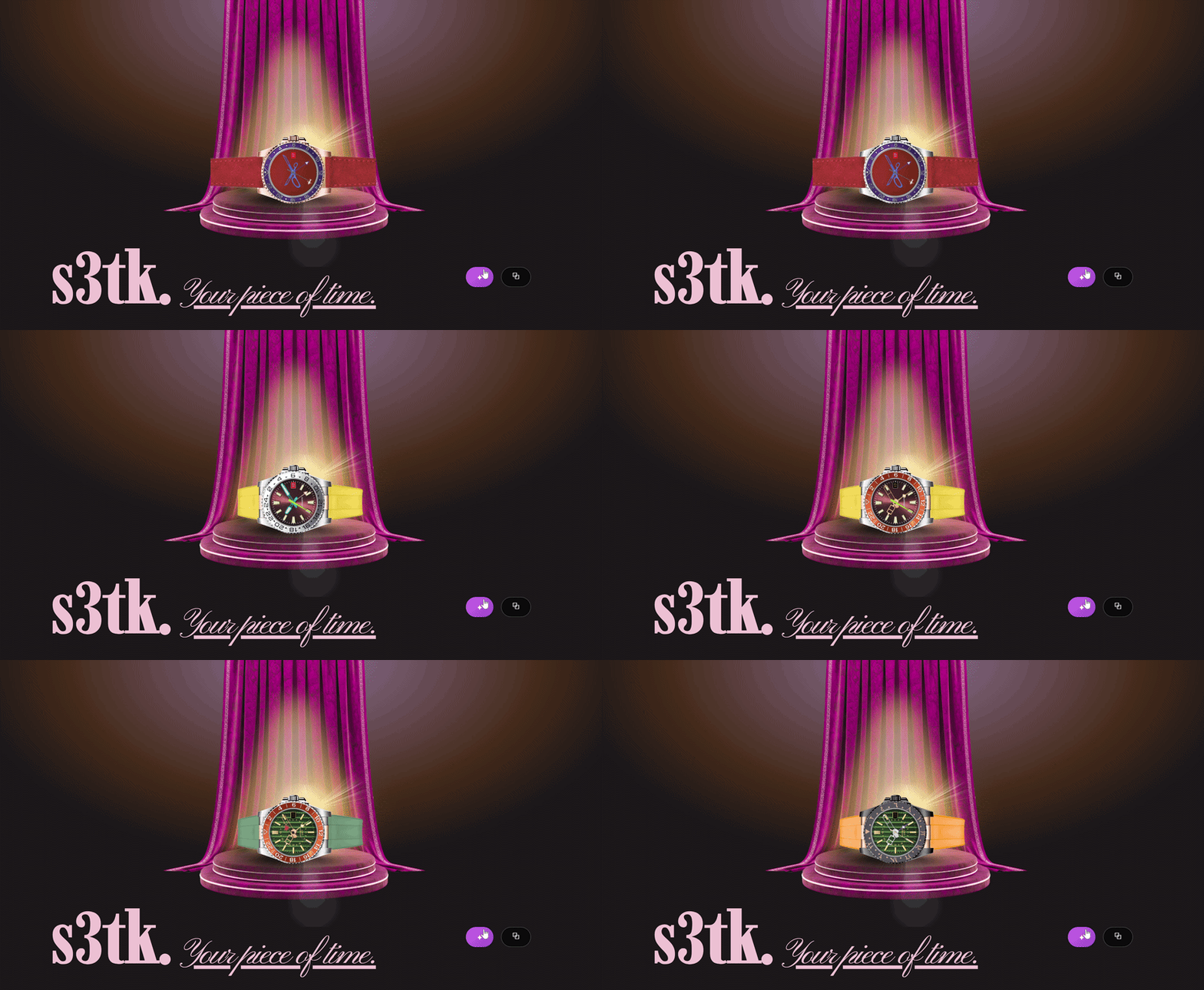
Website System Design
Watch configuration system
The premise

Thousands of possible watches should not feel like thousands of decisions.

The challenge

Possibility can become complexity.

The company offered an enormous range of combinations. Different cases, straps, materials, colours and configurations could create thousands of possible outcomes.

The challenge was not simply to display them. It was to make the possibility feel inviting, understandable and easy to navigate.
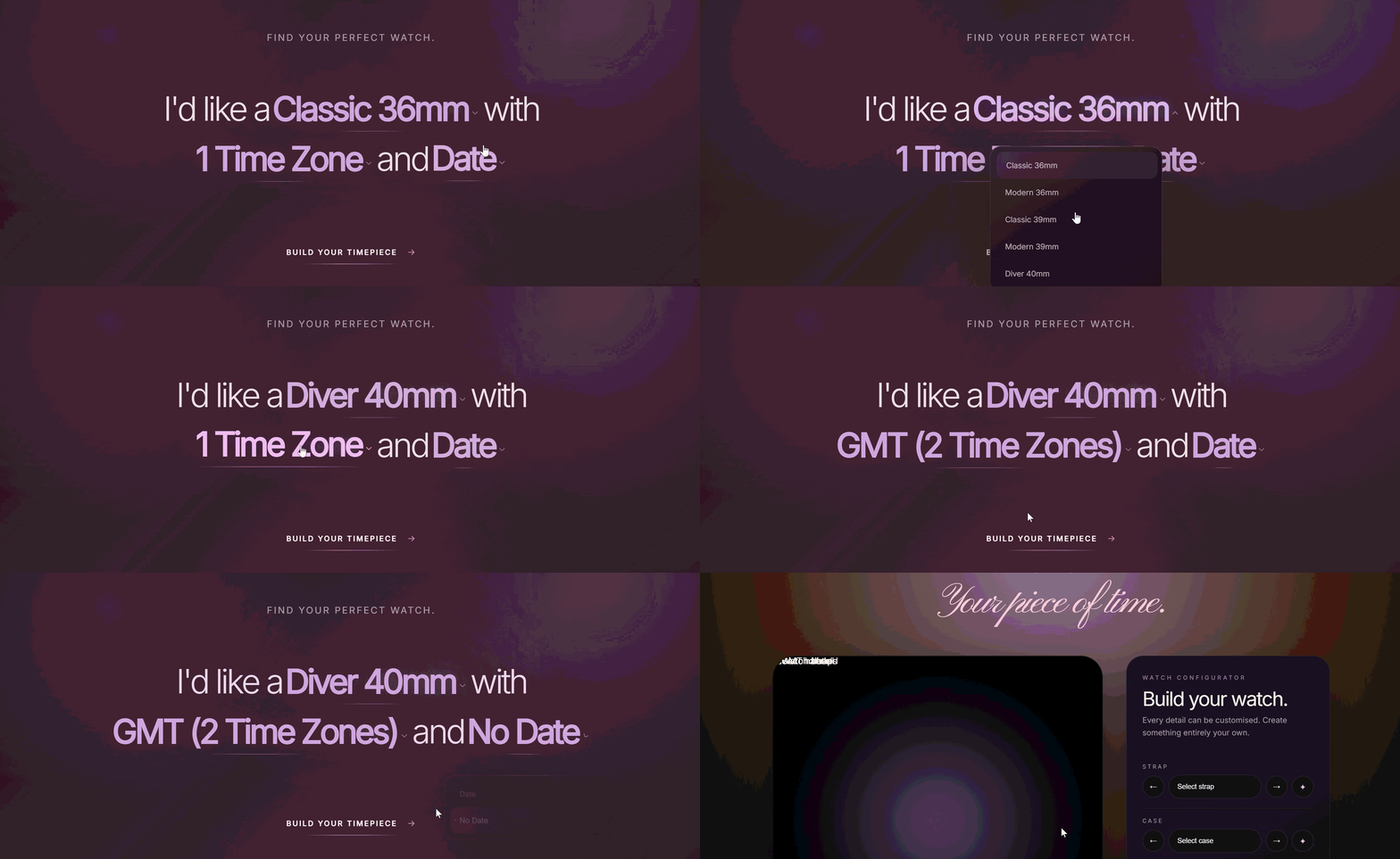
Watch selector mechanism

The interface became the system.

The thinking

Every choice should reveal another possibility.

Rather than treating every configuration as a separate product, the experience was built around the relationships between its parts.

The user could move through the system, change one element, see the result, and continue exploring without losing their place.

Complexity remained underneath. The experience remained simple.

The result

Thousands of combinations. One clear experience.

The final system gives the breadth of the collection room to exist without asking the visitor to understand the complexity behind it.

What looks simple is supported by a much larger system underneath.
Next story / 02

One cloth.
Infinite movement.

Story 02 / Product Design

One cloth.
An entire
body.

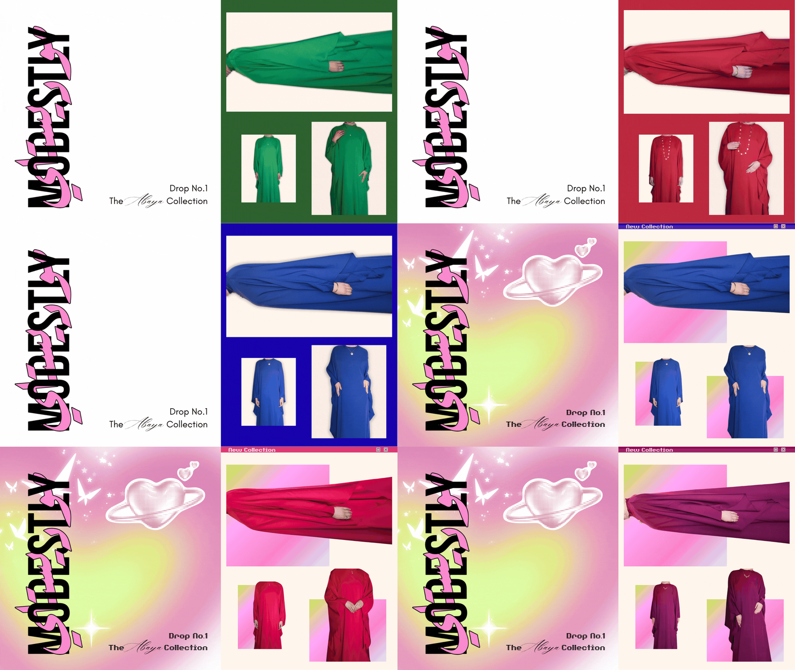
A garment designed around movement, identity and the possibility of becoming something different from one moment to the next.

Product Clothing Modestly
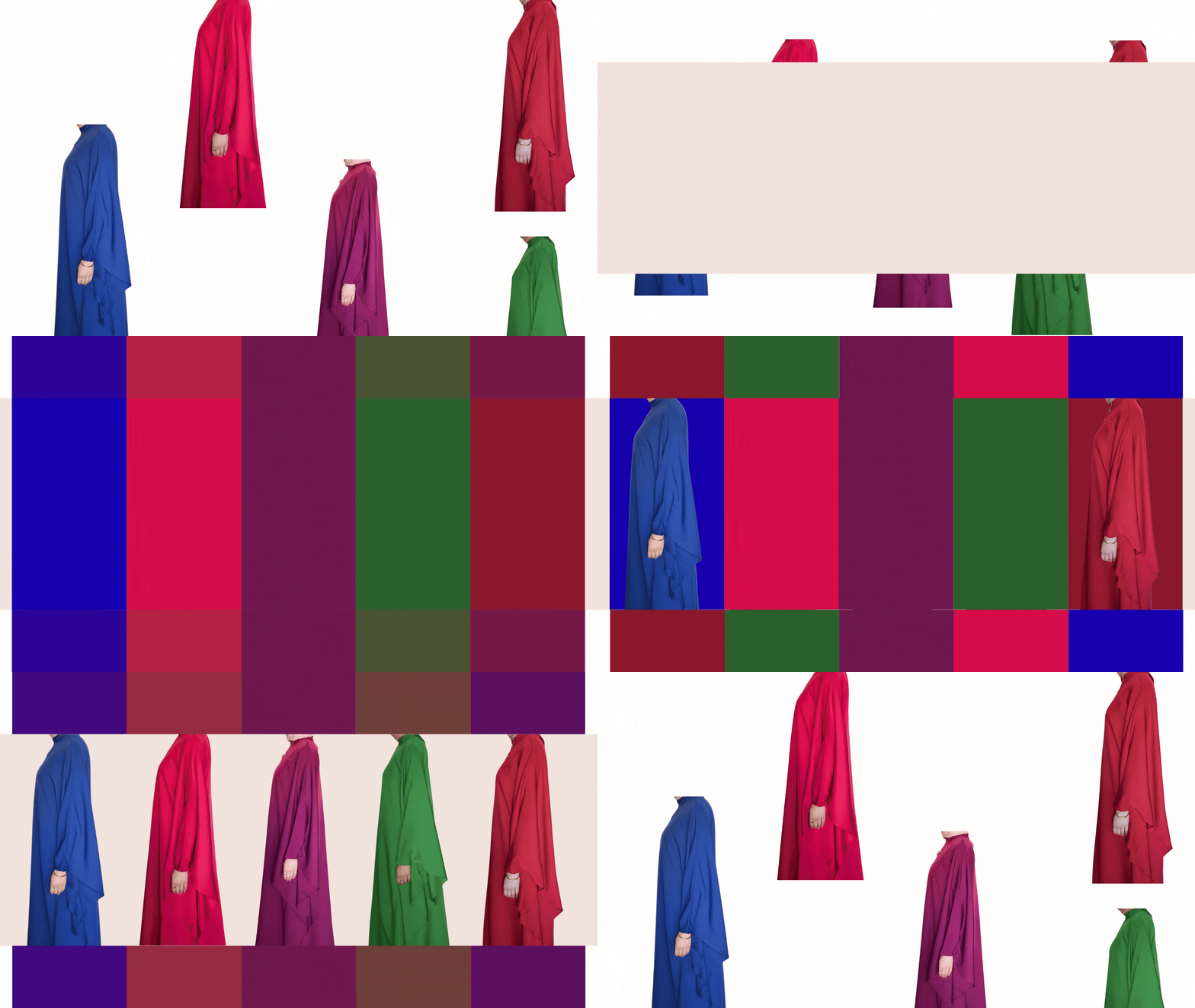
Modestly clothing interface changing between visual themes
The premise

One garment does not have to mean one identity.

The challenge

Clothing can carry more than one version of you.

The idea behind Modestly was simple: create a garment that could move with the person wearing it rather than forcing them into one fixed way of dressing.

The same piece could feel different depending on how it was styled, worn and understood.

So the digital experience needed to communicate that flexibility without over-explaining it.

Modestly garments arranged together in a spectrum
The collection One garment / many expressions

The garment stays simple. The person gets to change.

The thinking

Design for the person, not the prescribed version of them.

Rather than presenting modesty as something static, the experience treats it as something personal.

The visual language leaves room for different moods and different ways of wearing the same idea.

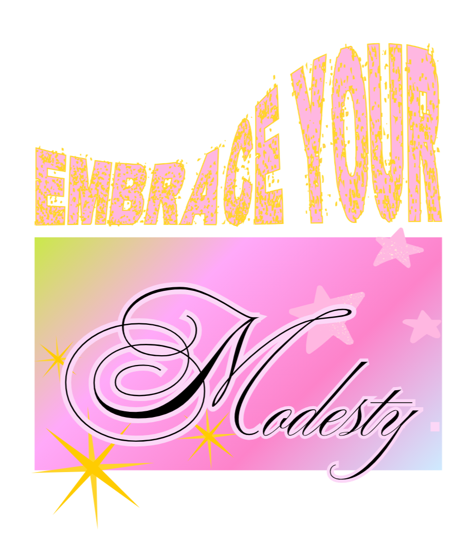
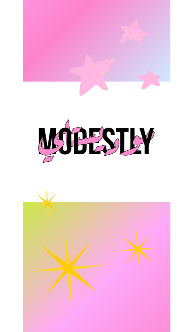
Even the website shifts between worlds — from more grown-up, restrained references to something much more playful and Y2K-inspired.

The point is not to choose one. It is to show that both can belong.

Modestly visual detail
The result

One piece. More than one way to be.

The result is a clothing experience that does not treat modesty, femininity or personal style as a single visual language.

One garment can move between worlds. The design simply gives it room to.

Next story / 03

Make waiting
for clothes
fun.

Story 03 / Interaction Design

Make waiting
for clothes
fun.

A pre-launch experience that turned a newsletter signup into something people actually wanted to play with.

Website Interaction Pre-launch
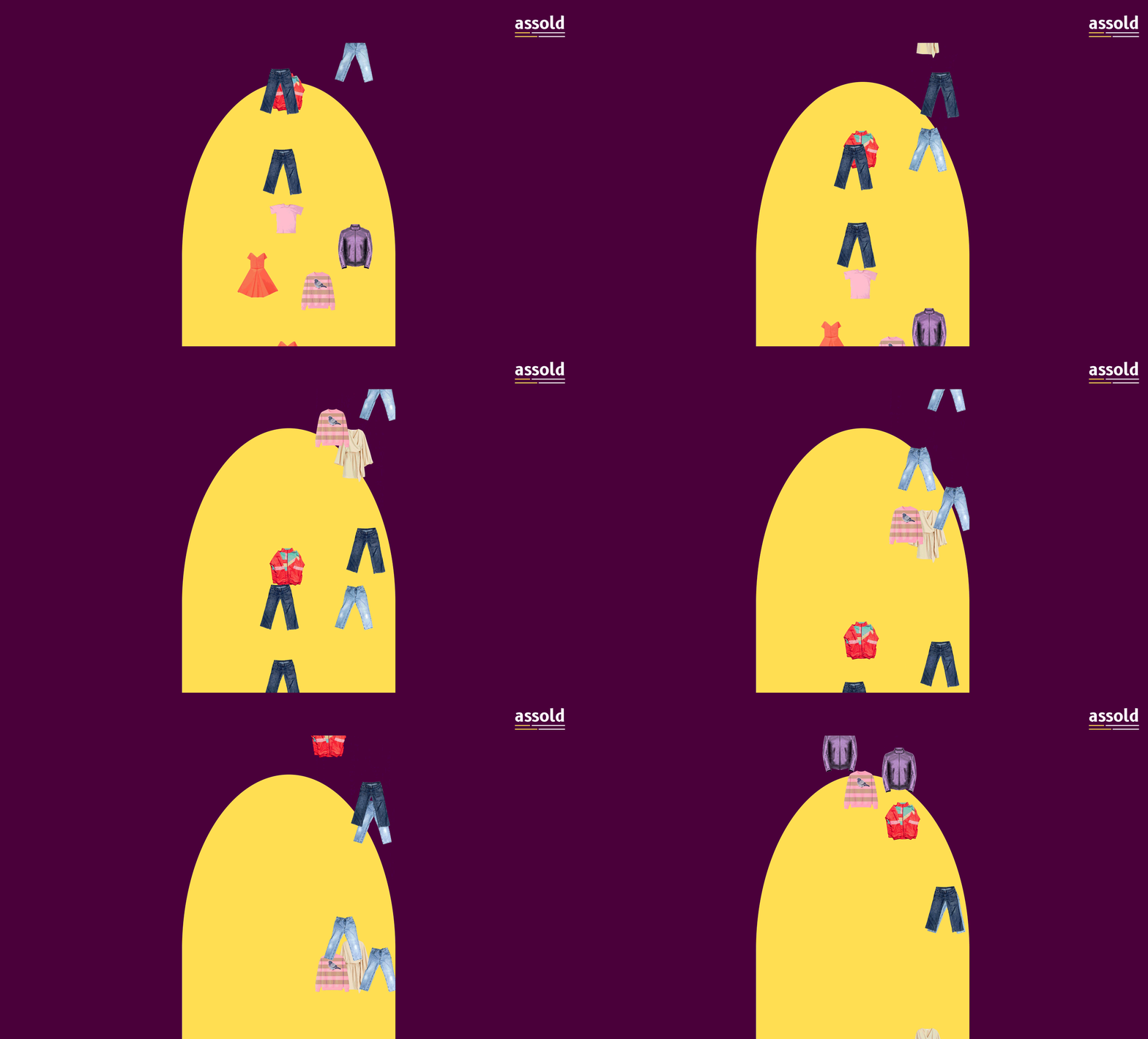
Clothes falling through the As Sold website
The premise

What if joining a waitlist didn't feel like joining a waitlist?

The challenge

Nobody wants to be asked for their email.

A clothing brand preparing for launch had a familiar problem: build anticipation, collect interest and grow a mailing list.

The obvious solution was a newsletter form. The less obvious question was whether the newsletter had to behave like one.

Instead of putting the form in front of people, the experience gave them something to do first.

So we made the clothes fall out of the sky.

The interaction

Pick something up. Become a good person.

Clothes fall continuously through the experience. When someone tries to catch or pick one up, they are rewarded with something slightly unexpected: the newsletter.

The signup is no longer an interruption between the visitor and the product. It becomes the reward for interacting with it.

As Sold interaction leading to newsletter signup
The reward Interaction → newsletter
The identity
As Sold logo
AS SOLDASS OLD

The name was already doing something.

The identity leans into the strange little accident hidden inside the name.

Read one way: AS SOLD.
Read another: ASS OLD.

Rather than correcting the awkwardness, the identity gives it room to become part of the personality.

It is slightly stupid. That is exactly why it works.

Sometimes the thing
that looks wrong
is the thing worth keeping.

The thinking

The waiting became part of the product.

A pre-launch period is usually treated as dead time. The product isn't ready. The customer waits. The brand asks for an email.

Here, that waiting became the experience. The clothes falling through the page create movement, curiosity and a reason to stay.

The newsletter is still there. It just doesn't announce itself as the most important thing on the page.

The result

Waiting became something worth doing.

The experience turns a familiar pre-launch mechanic into part of the brand itself.

Instead of asking: “Will you join our newsletter?” it asks something much more interesting: “Can you catch this?”

Next story / 04

One link.
Every voice
separated.

Story 04 / Software Design

One link.
Every voice
separated.

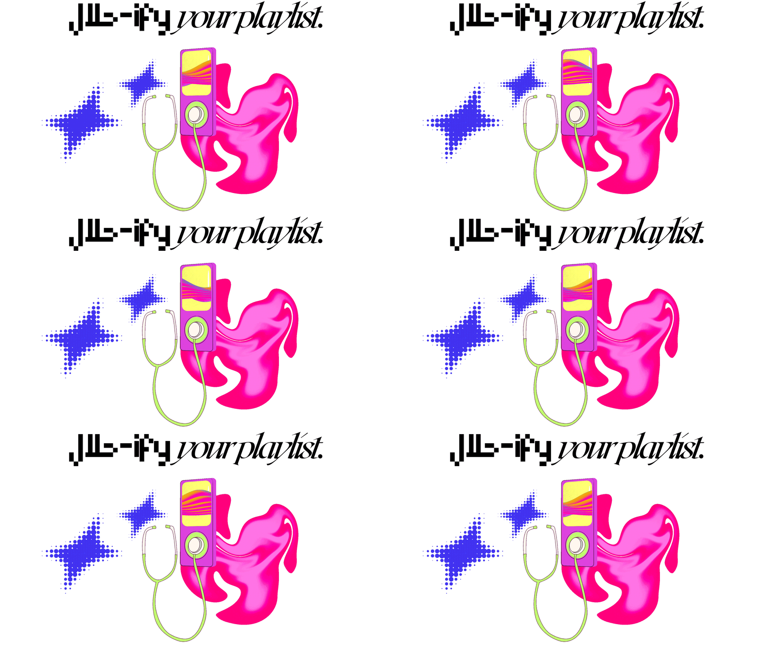
A deceptively simple interface for a surprisingly complicated piece of software: separating vocals from a song through one link.

Software Interface Halalify
Halalify interface and vocal separation experience
The premise

The complicated part should never have to look complicated.

The challenge

A lot has to happen after one link.

Separating the individual voices from a finished song is not a simple operation. There is processing, analysis, separation and a lot of things the person using the tool should never have to think about.

The design challenge was therefore almost the opposite of showing how sophisticated the software was. It was making the sophistication disappear.

One link in.
The voices come out.

The idea

Reduce the interface until only the idea remains.

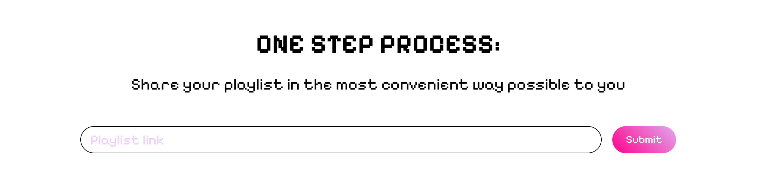
The experience is built around one familiar action: paste a link.

No complicated controls. No technical language. No need to understand what happens between the input and the result.

The interface simply asks for the thing the system needs and gets out of the way.

Halalify simple link input interface
The interface One input / one action

Simple on
purpose.

The interface does not try to communicate everything the software can do. It communicates what the person needs to do next. That distinction is the whole point.

The thinking

Complexity belongs behind the curtain.

Good software can be technically impressive without asking the user to appreciate the technical work.

Halalify takes something that would normally require knowledge of audio processing and turns it into a familiar web interaction.

A link goes in. The software does the difficult part. The result is what matters.

The result

A complicated system with nothing complicated to explain.

The final experience is intentionally understated. The interface gives the software one job: make something difficult feel obvious.

Sometimes the best evidence of complexity is how little of it the user ever sees.

Next story / 05

Find the stone.
Find the price.

Story 05 / Digital Tool

Find the stone.
Find the price.

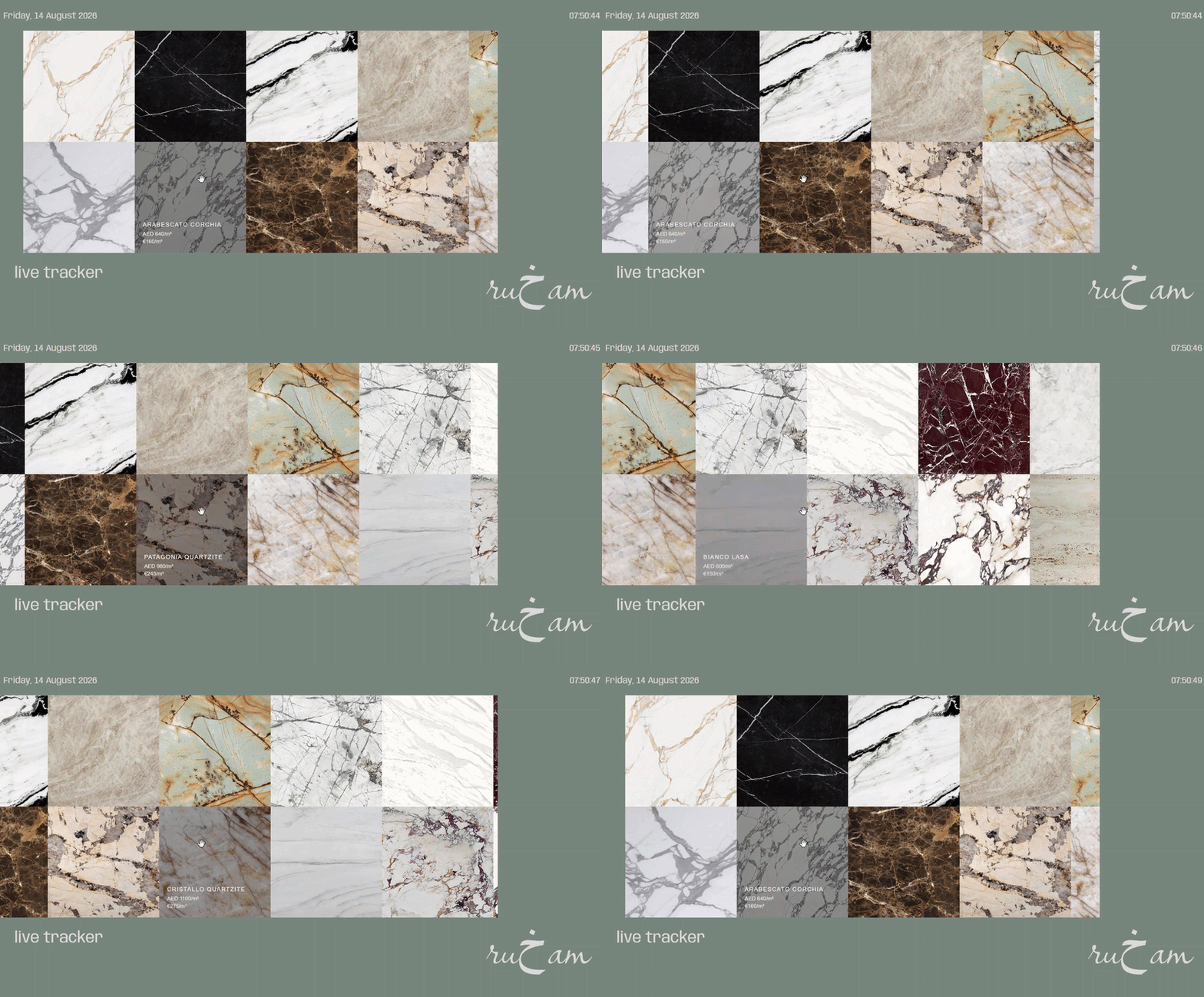
A visual tool for finding marble tile locally — and seeing what it actually costs before the search becomes a phone call.

Tool Construction Data
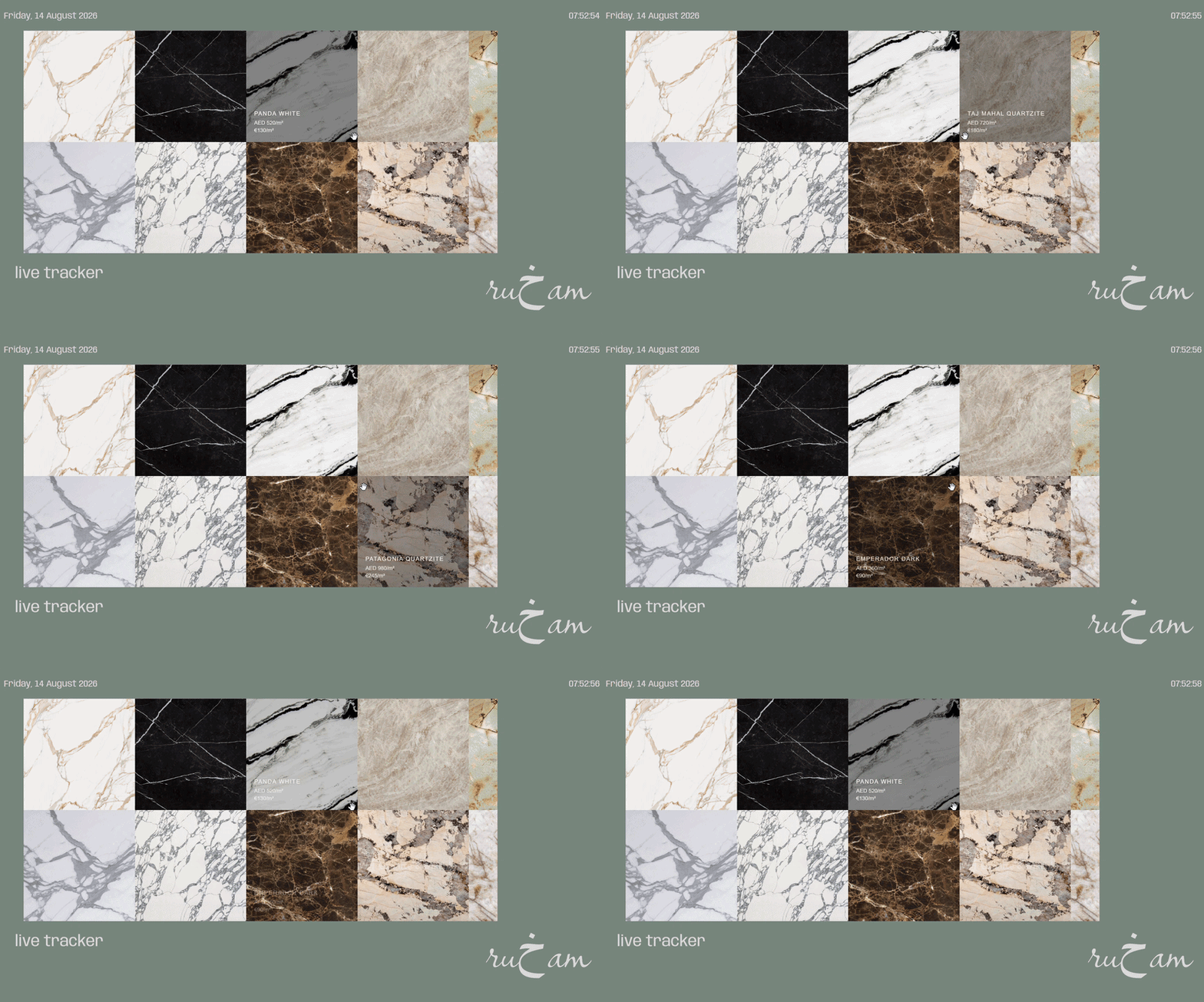
Ru5am marble price interface
The premise

The stone is already there. The hard part is finding what it costs.

The problem

Buying stone should not feel like detective work.

For contractors, finding the right marble can mean searching through different suppliers, comparing names, checking availability and trying to understand whether the price being quoted is actually a good one.

The information exists. It is just rarely presented in a way that makes comparison feel easy.

Ru5am was built around that gap.

Look at the stone.
Know the price.

The thinking

Let the material lead the interface.

Instead of beginning with a traditional database or catalogue, the experience starts with the thing people are actually looking for: the stone.

The marble becomes the navigation. Hovering over it reveals the information behind it — the name, the source and the price.

The interface stays visual while the data remains immediately available.

Ru5am browsing and navigation experience
The catalogue Browse / compare / discover
The identity

A name for a material that already has a language.

The identity stays close to the material itself. Nothing needs to compete with the stone. The visual world is quiet, tactile and slightly architectural — allowing the marble, its names and its prices to do most of the talking.

The result

Less searching.
More finding.

Ru5am turns a fragmented search for marble into something much closer to browsing.

The material becomes the interface. The price becomes part of the object. And what could have been another database becomes a place to actually look around.

Next story / 06

A tradition,
rebuilt in blocks.

Story 06 / Product + Digital

A tradition,
rebuilt
in blocks.

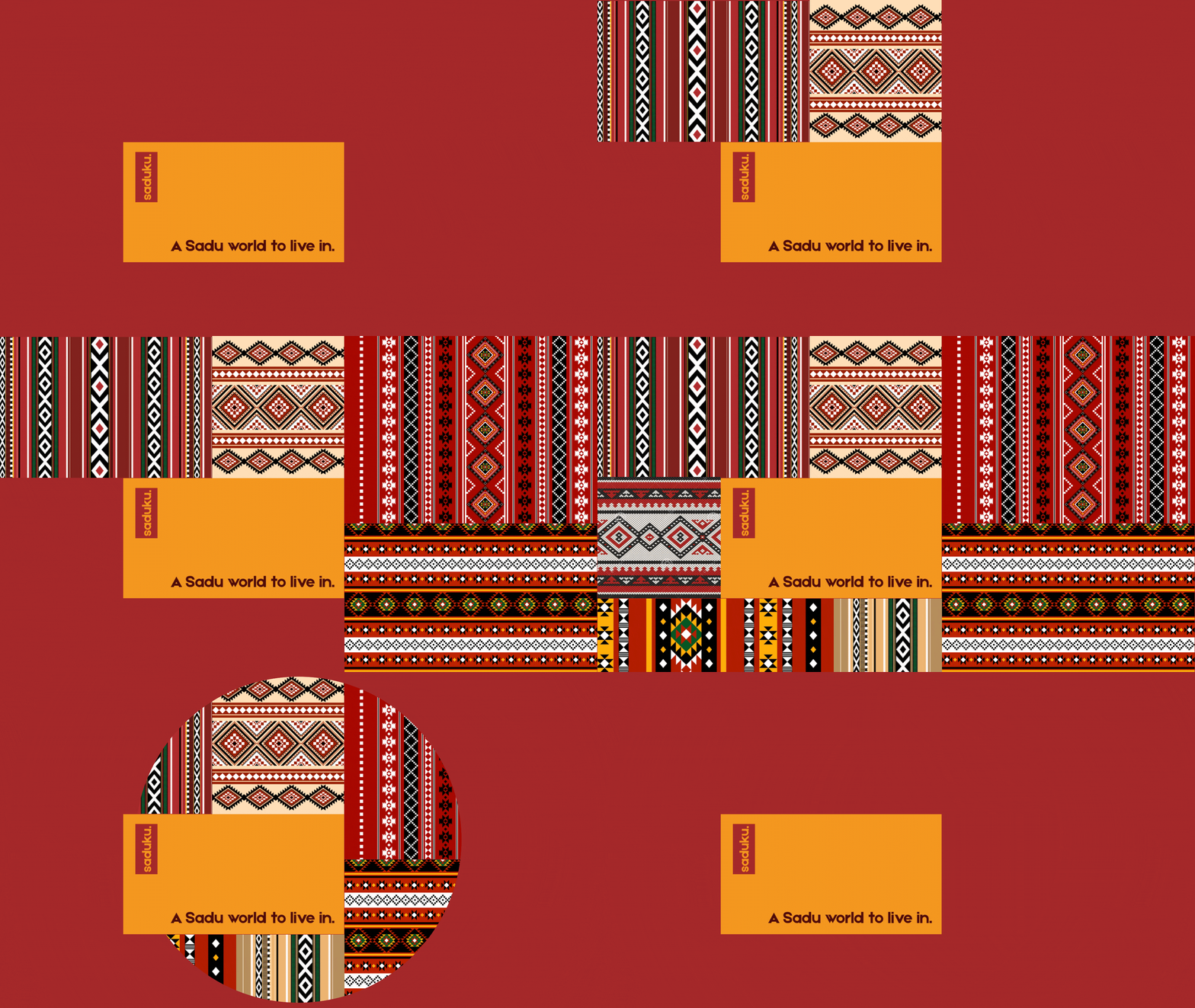
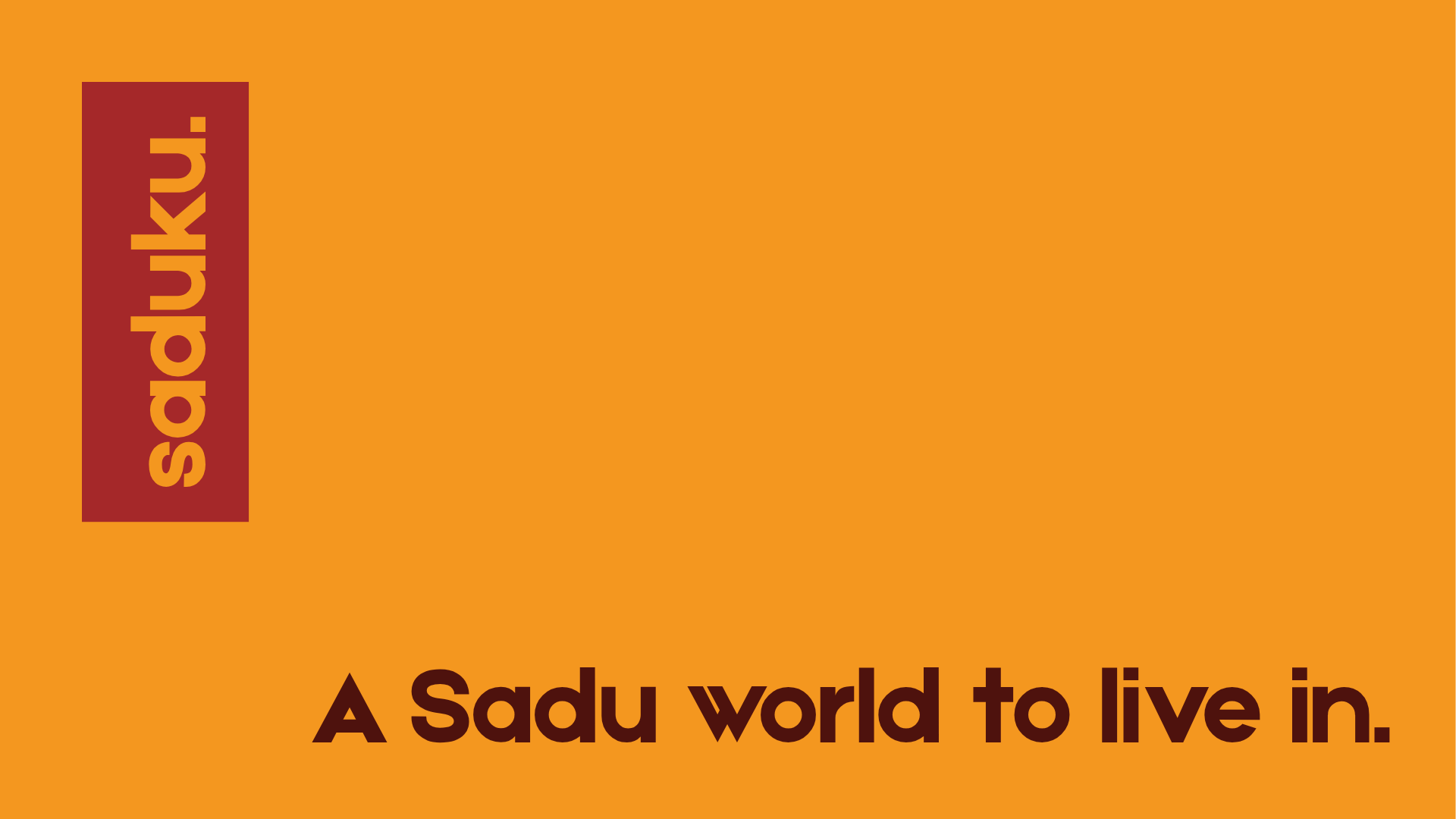
A contemporary expression of Sadu textile patterns — translated into clothing, products and a digital experience built around the same visual language.

Product Web Sadu
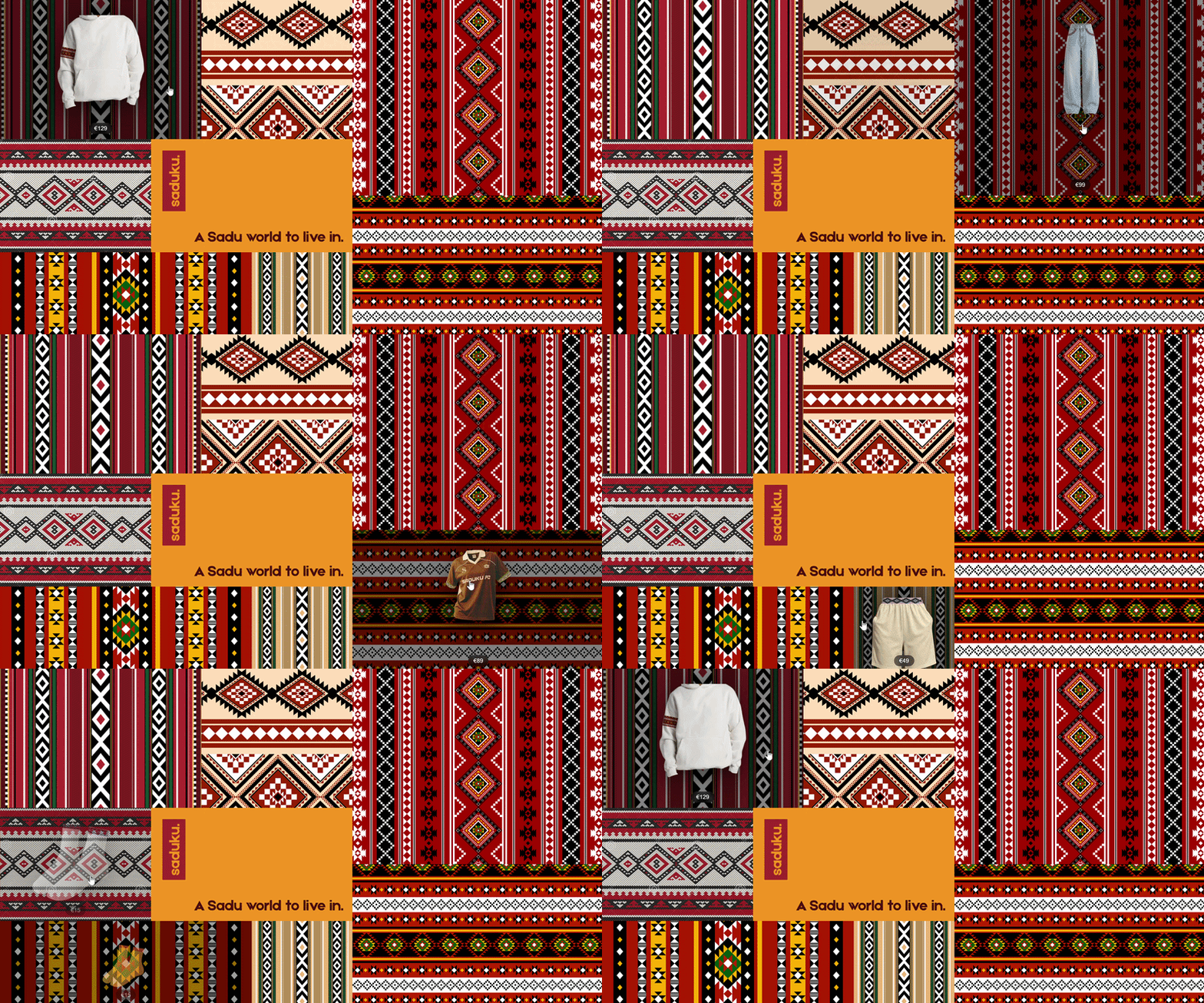
Saduku patterned interface with products appearing on hover
The premise

What if a traditional pattern could become an interface?

The challenge

Preserve the pattern without freezing it in time.

Sadu is deeply recognisable through its repeated geometric forms, colours and rhythms. The challenge was not to reproduce those patterns literally and stop there.

It was to find a way for the visual language to become useful in a contemporary experience.

The pattern needed to do more than sit on the surface. It needed to become the structure.

Pattern becomes
navigation.

The thinking

The grid is not decoration. It is the system.

The digital experience takes the repetition and modularity of Sadu and turns it into a grid of possibilities.

Each block belongs to the larger pattern, but each one can also become a point of interaction. Hovering reveals the products sitting inside the system.

The visual language and the navigation become the same thing.

Saduku products appearing over patterned blocks
The pattern Hover / reveal / explore
The identity

A name built from a familiar kind of grid.

The name Saduku plays with the logic of Sudoku — a world built from blocks, relationships and patterns.

That connection became more than a naming detail. It gave the identity a simple conceptual bridge between something familiar and something culturally specific.

Sadu becomes the visual language. Sudoku becomes the structural idea. Saduku sits somewhere between them.

The grid
survives
the screen.

The interaction changes with the device, but the underlying idea does not. On smaller screens, where hover is no longer available, the same product-reveal logic can become a tap interaction.

The pattern remains the navigation. The screen simply changes how you enter it.

The result

A tradition that doesn't need to stay still.

Saduku takes a visual language with generations of history and gives it another place to live.

On fabric, it becomes pattern. On products, it becomes identity. On screen, it becomes navigation.

The system changes medium without losing its character.

Next story / 07

A coffee shop
with something
to hide.

Story 07 / Experience Design

A cafe with
something
to hide.

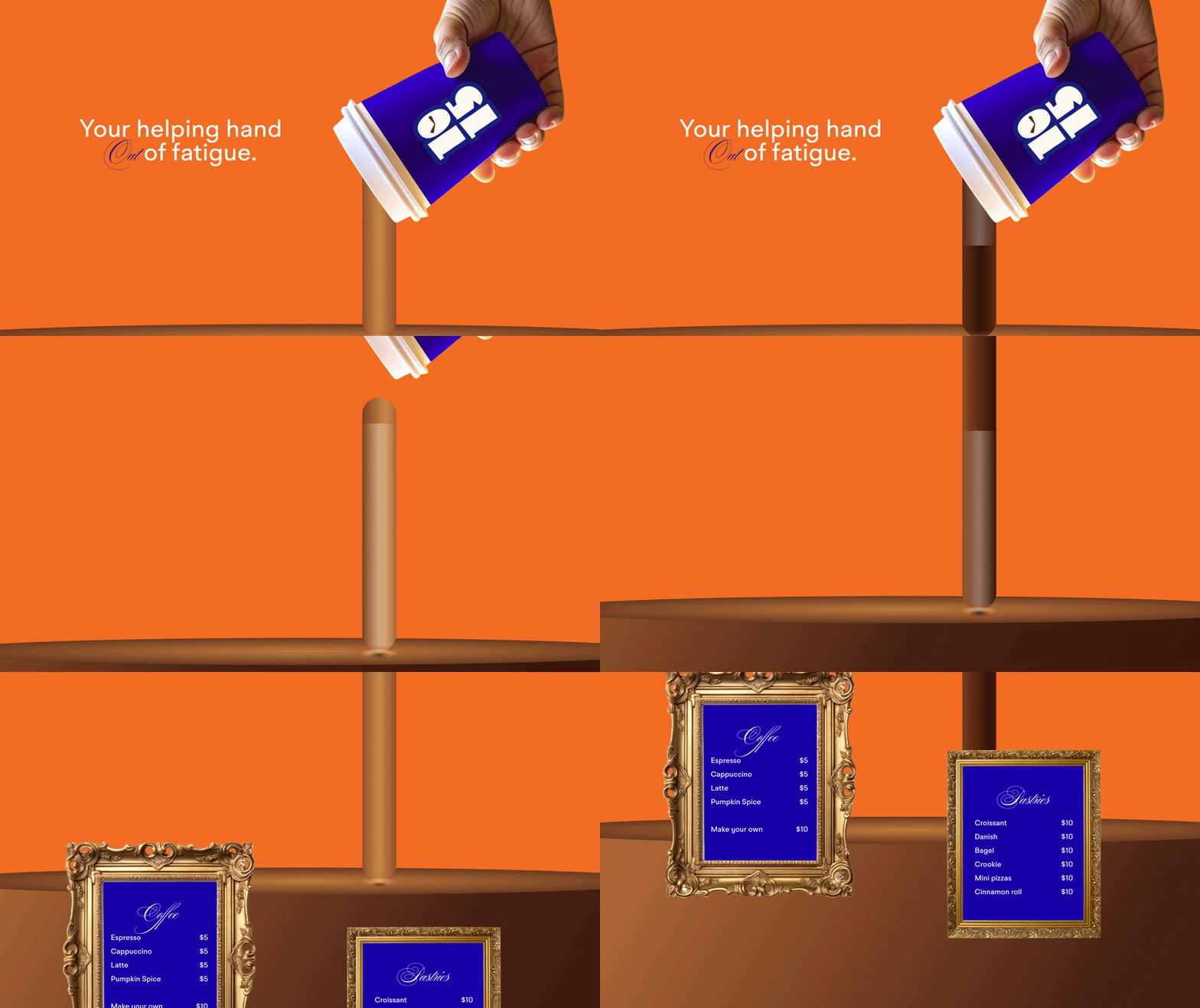
A digital world built around a coffee shop — where spills become clues, menus become artifacts, and the website gives people a reason to keep looking.

Website Interior Experience
Coffee spilling across the 1015 website
The premise

What if the website felt like a place worth exploring?

The challenge

A coffee shop doesn't need another menu online.

The easy solution would have been to make a conventional café website. A menu. Some photos. Opening hours. A location. Done.

But 1015 already had a character of its own. The digital experience needed to feel less like an information page and more like another room inside the café.

Something people could wander through. Something that rewarded curiosity.

Then the coffee
spilled everywhere.

Coffee spill filling the 1015 website as the page scrolls
Scroll / spill The page becomes part of the mess
The thinking

The interaction became part of the story.

Instead of keeping the visual identity separate from the interaction, the two were allowed to interfere with each other.

Coffee does not politely stay inside a rectangle. So neither does the website. As the visitor moves through the page, the spill grows, spreads and changes the environment around it.

A simple scroll becomes a small physical experience.

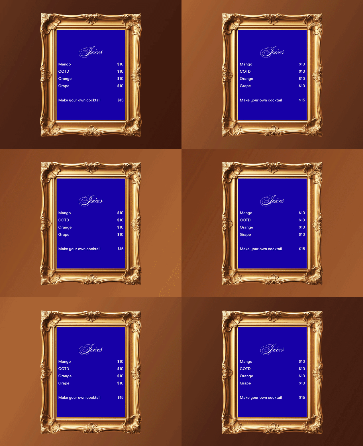
1015 menu displayed inside a vintage frame
The physical language
The detail

The website gives you just enough to wonder what else is there.

The experience is deliberately a little strange. Clues appear where you don't expect them. Small details reward attention. The digital environment begins to feel like it has its own rules.

That curiosity is the point. The website isn't only telling you about 1015. It's giving you a reason to remember it.

The result

A café website
that behaves
like a café.

The final experience takes the physical personality of 1015 and translates it into something digital without cleaning away all the interesting parts.

The spill becomes interaction. The frames become atmosphere. The clues become a reason to explore.

It doesn't just tell people where the coffee shop is. It gives them a little taste of it before they arrive.

Next story / 08

Everything
in the glass.

Story 08 / Product

Everything
in the glass.

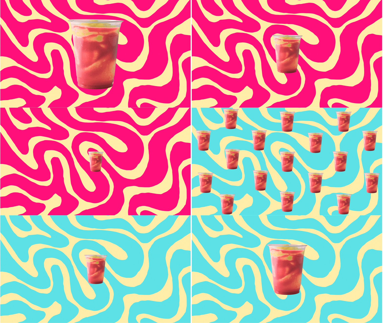
Sometimes the idea is simple: make something so good, it deserves to exist exactly as it is.

Product Object Awar Galb
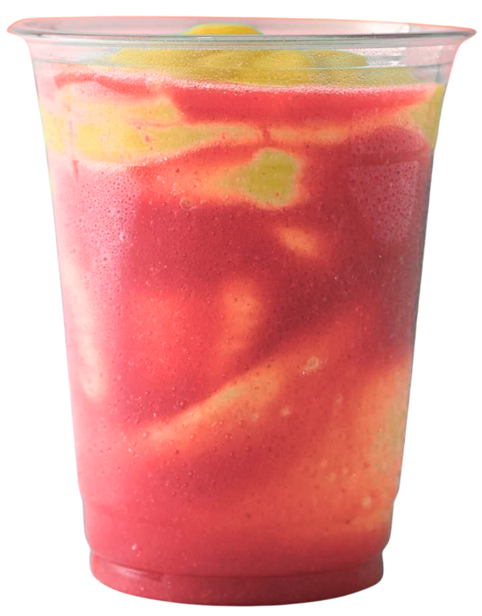
Awar Galb juice product
The premise

Not everything needs a complicated reason to exist.

The decision

The product was already the idea.

Awar Galb did not need a website full of unnecessary explanation. It needed somewhere the product could speak for itself.

The decision was to make the digital experience as direct as the drink: see it. Want it. Get it.

No unnecessary layers between the product and the person looking at it.

Awar Galb juice

The best interface
is sometimes just
the product.

Why it exists

Because the juice was good enough to deserve a world around it.

The website does not try to manufacture importance around the product. It gives the product enough space to feel desirable.

A single image. A clear proposition. A reason to buy.

Sometimes restraint is the design.

The result

Just the best juice.

There was no need to turn a simple product into a complicated digital story. The story was already there. The website simply gave it a place to exist.

Next story / 09

A website
worthy
of an A*.

Story 09 / Identity + Digital

A website
worthy
of an A*.

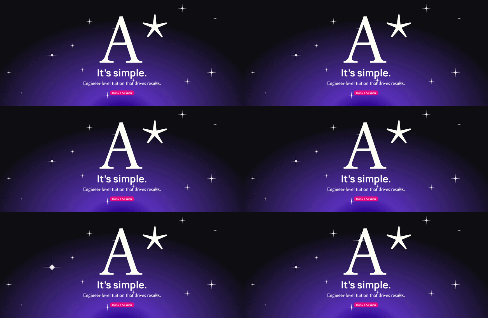
A student-focused educational brand given a visual identity that could speak to parents, students and the ambition behind the grade.

Website Identity Education
A Star Student website hero
The premise

What if an educational brand could feel ambitious without feeling boring?

The challenge

Education has two very different audiences.

For parents, the website needs to communicate trust, quality and results. For students, it needs to feel relevant, energising and approachable.

Too far in one direction and the brand becomes corporate. Too far in the other and it risks losing credibility.

The visual identity needed to hold both worlds at the same time.

Professional
Playful
Optimistic
Confident
The thinking

The palette had to do both jobs.

The colour system balances familiar signals of professionalism with brighter, more playful moments.

The deeper tones give parents the confidence that this is a serious educational service. The brighter colours give students something more expressive to connect with.

Neither audience is treated as an afterthought. The system is designed for both.

A Star Student graphic visual
A Star Student star graphic
The visual language Stars / grades / ambition
For parents

Serious enough to trust.

Clear information, structured layouts and a confident visual language create the feeling of a professional educational service.

For students

Fun enough to remember.

Colour, movement and expressive star visuals make the experience feel closer to the students it is actually trying to reach.

The result

A serious brand
with a little
personality.

The final website doesn't ask the brand to choose between credibility and energy. It gives each one a place.

The result is an educational experience that can reassure the person paying for the education while still feeling relevant to the person receiving it.

A website worthy of the grade.

Back to the beginning

Why
not?

About WHY NOT.

We decide what deserves to exist.

The world does not need more things. It needs better reasons for the things we choose to make.

The practice

Different mediums. One way of thinking.

WHY NOT. is a multidisciplinary design organization working across identities, digital experiences, products, spaces and systems.

We move between mediums because the problem rarely arrives in one.

Brands 01
Websites 02
Products 03
Spaces 04
Packaging 05
Systems 06

Why
exist?

Because making something is easy. Deciding whether it should exist is harder.

We are interested in that decision. The idea before the identity. The behaviour before the interface. The object before the packaging. The system before the surface.

We believe design is not simply a way to make things look better. It is a way to decide what deserves attention, meaning and permanence.

The question

WHY
NOTж

Not a slogan. A question we keep asking. Why this? Why now? Why this way? And sometimes, simply: Why not?

We are not
here to make more.

01
Not decoration without purpose.
02
Not trends for the sake of relevance.
03
Not one discipline pretending to solve everything.
04
Not work that exists only to fill a portfolio.
The idea

They don't just make things. They study why things should exist.

Stories, research, experiments, talks and publications become part of the same ongoing investigation. What we make is only one part of it.

Questions

Things worth asking.

Before deciding how something should look, we ask whether it should exist at all. What does it add? Who does it serve? What becomes possible because it exists? Sometimes the answer is a better version of the original idea. Sometimes the answer is to make something entirely different. And sometimes, the answer is no.
A good idea creates tension between what is expected and what could be possible. But an interesting idea is not automatically a useful one. We look for the point where meaning, function and possibility begin reinforcing one another. That is usually where the work becomes worth doing.
Because a problem rarely cares what discipline you studied. A brand can become a product. A product can become a space. A website can become a system. The medium should follow the idea, not the other way around.
When removing something would make the idea weaker rather than clearer. Not when every surface has been polished. Not when every possibility has been explored. When the thing knows what it needs to be.
More than appearance. Design decides what people notice, how they move through things, what they remember, and sometimes what they value. That makes every design decision a decision with consequences.
Then we find out. Not every question needs certainty before it becomes an experiment. Some things deserve to exist simply because someone was willing to ask.

The question comes first. The making comes after.

WHY NOT. / Policies Last updated / August 2026
Start something

Build something worth existing.

Tell us what you're thinking. It doesn't need to be finished. It doesn't even need to make sense yet. Bring us the question.

01 / Work inquiries

Let's build something.

Have a brand, product, website, space or system that needs a reason to exist? Tell us about it. The more unfinished the idea, the better.

Or email us directly
[email protected]
02 / Careers

Come work
with us.

Think you should be here? Tell us who you are, what you make, and why you think WHY NOT. needs you.

Other questions

Something else? We're listening.

[email protected]
WHY NOT. / Contact Let's see where it goes.
Error / 404
404

This doesn't
exist.

At least not here. Maybe it shouldn't exist. Maybe we just haven't built it yet.

Every challenge is unique.
Let’s talk about yours.

© WhyNot. All rights reserved.